 I finished some work on the character select screen last night, which means that that is now good to go. I also built a version that was uploaded to my iPad, which means we are back up and running on the device. This has been sent to our potential artists for them to look at. It also means I have a test to see if we can get the app out to other testers…
I now just have the load & save screen to be implemented before we are green light on functional testing. That is, test the game for gameplay issues. You should be able to fully play the game through on the iPad. This is prior to some new features and the relevant eye candy changes, not to mention final graphics. But it should allow me to check for device and porting issues.
Once the iPad test version goes out I will spend a little time making sure I have dealt with the iPhone4(s) and prior. This is mainly an asset issue and dealing with different resolutions.
After this I will likely make a Windows and OSX version available for testing. Again this is to just increase the scope of gameplay testing, and not necessarily to focus on what a desktop version would look like.
I will spend a little time on an Android tablet version and Playbook version. I will not be looking at Android handsets during this phase.
I am now hoping to be ready to start pushing test versions out from the end of this month.
We have a collective of artists potentially prepared to work on the game, which means we can start honing in on the visual requirements of the game. I can hopefully announce more about that in the coming weeks.
If you want any more playtesters for the ipad I would be happy to help out, and would love to see how my fav. game from the old Speccy days will work on the iPad.
I am really looking forward to seeing the finished version as well with all the other improvements you are suggesting.
If I may suggest something regarding the art…
I bet you have some ideas about it already, but I would really encourage you to make the art fit the “theme” of the world of LOM.
Instead of just put there some generic faces or forests, think on the kind of story that LOM tells. To me it sounds a lot like LOTR, at least in the mood of the story, with some differences.
The peoples of Midnight are facing virtually the total annihilation by Doomdark forces, basically the End of their World as they know it (just like the Free Peoples face the End of the Middle Earth they know if it falls on Sauron’s hands).
LOM doesn’t tell the story of an ordinary war; or the story of a dungeons & dragons quest. It’s not a struggle between countries for a contested territory, or a war that is realistic in the terms of the real world. It’s not a Game of Thrones kind of war, if you allow the comparison, where all sides have their righteous reasons to fight for.
Instead, in LOM, just like in LOTR, people have given up hope. The Dark Lord (sorry, the Frozen Lord) Doomdark wants to crush all opposition, and those that don’t opose make them his servants. He is already the most powerful “lord” in Midnight, the one with most armies and most fortresses. But that’s not enough and he demand absolute power and to do his will as he pleases.
The Free are divided, conservative, not moving from their fortresses hoping to be spared if they show no opposition. It’s not until Luxor brings them courage to fight back the Ice Fear, as the last Moonprince that wields the Moonring, that they start seen a glimpse of hope.
I’m going all this deep into the “psychology” of the characters because the art HAS to be a reflection of all of this.
I remember the graphics from The Citadel and I sincerely loathed them. Not because they lack quality, that they don’t, but because they don’t fit at all with the Universe of Midnight.
Back in the early 90’s, when the 256 color VGA was the big new thing, I understand that the artists wanted to show it off by making everything super-colorful. As a result, the character faces in that game look like happy people from Candyland. (*)
Now that we don’t have any graphic technical limitation, we should not go for “the most colorful thing we can put onscreen without getting diabetes”, or “realistic pictures”, but we should have a clear direction, transmit a mood, a feeling for the setting.
Midnight and its people, its weather, its forests, its montains, should look gloomy, epic and ethereal. Maybe like Alan Lee’s watercolor illustrations for LOTR. http://goo.gl/IbjJO
Even the user interface should transmit the seriousness of the whole setting.
TL;DR: Please, don’t replace the old Spectrum art of a mountain with just a drawing of a generic mountain covered in snow. What you need is the drawing of how a mountain from Midnight show look like.
(*) : Although if you want to sell the game much more, I fear you will find it easier to do so if you put “cute Farmville-like” graphics everywhere insted. Oh, god, I hope you don’t do so. 🙂
You know where I am if you need iPad (1st gen), iPhone 4 or PlayBook testing from me 🙂
Great news on the progress by the way.
I will be also glad to help. I have 3 iPads ( 1,2 and 3 ) as well as an iPhone 4s.
Count me in for testing. My strategy was “hold out in Xajorkith” … Will be good to test this approach on the iPad version.
I’ve been following with interest, and I’ll certainly be making the purchase on the iPad when its released. If you need a website to help promote the game, maybe I can help 🙂
There is nothing wrong with the original LOM graphics.
If it is absolutely necessary to spice them up, have a look what they did with Sword & Sworcery EP game. To get an idea how it might translate to LOM, see the wallpaper here:
http://www.superbrothers.ca/
The original graphics in LOM are unquestionably a huge part of the game, and so I’m definitely in the ‘the original graphics are fine, don’t touch them’ camp.
But I wouldn’t have any problem with an start option to play with either the original or with new art. I can’t personally visualize graphics that would be better than what the original had, but that certainly doesn’t mean such a thing is not possible by any means. I for one would be the first to applaud such an achievement, and it may help bring in new players to the game.
LOM mentioned in some of the Speccy 30th Anniversary articles:
http://www.mirror.co.uk/news/technology-science/technology/zx-spectrum-top-10-online-802943
Good news, Chris! It’s great to hear of progress – and I’ll be happy to test as well, if more testers are needed. iPad 2, iPhone 4 and iPod 3rd Gen.
The original graphics were outstanding in the context of the Spectrum (256×192, 2-3 colors). But for the moderns standards (an IPad 3 has more than 100 times higher resolution, and millions of colors) they certainly look like a quick sketch compared to any other current game.
Unless you manage to rework the old simplistic graphics into some very special style (for example, making the whole landscaping look like hand drawn landscape, like an illustration in a book) that binds simplicity with quality, I fear only we the fans are going to get the game when it comes out.
I love how it sounds. 🙂
I love how it sounds. 🙂
Some links were missing in my comment… reposted.
Now that I re-read those old posts you linked… what happened with Doomdark Revenge’s graphics and jiwsaw pieces? Are you still planing to use them for something?
Now that you are into the new version of LOM with those interesting 3D-but-still-billboards graphics, I guess you will want to apply the same new techniques for a possible DDR, Citadel and Eye of the Moon sequels…
But have those DDR graphics seen the light before? I think they look awesome.
Ok, the graphics were by Jure Rogelj, and Jure decided not to work on this project. They were never used o anything other than the development of DDR. However you can check out his website for stuff that he is doing http://jugilus.com/wordpress/ So we started a fresh. The jigsaw mechanic will likely be used but more subtle and just on terrain. We will likely ramp it up on following games.
Thanks for the link. He seems to be working in something really similar to LOM, but not set on Midnight. Oh well. I wish the best of luck for everyone. 🙂
My opinion on this is certainly moving towards a more radical graphics update, as huge a fan of the original style as I am.
Like everyone here, I love the touch control and new movement added to the game, as well as the map and grouping of characters options. I’ve also suggested more variety in the text descriptions, now memory is not an issue. Hardly ‘authentic’ features but a definite improvement to (not the core game itself, but) the experience of playing.
But talk about changing the art and we divide into 2 camps. And while I still like the idea of an option of playing with the original graphics, maybe it’s better to jettison the past entirely rather than compromise the end result by having to also support these legacy assets and the limitations they would impose.
I have the original emulated on my PC, and I have the original Spectrum games sitting in their boxes in my computer room. I can play the original any time I want. Time to look to the future, to Eye of the Moon, rather than the past. 😉
I too support a graphical update.
I suspect that the style of the original artwork was at least in part driven by the capabilities of the machine in ran on. I’m sure it was a large world to cram into 48k of memory, and the line drawings kept the dreaded colour clash at bay – the question is whether the game would have looked like it did had the option been there to approach it differently?
Keeping other elements of the original, as it being turn based and using grid/hex movement rather than real time, etc – that’s what makes it into what it is…. But graphically, it should look as good as the artist can make it look on the target system(s).
Style wise is a tough choice – but personally, I like my games to look like a real world, something that I recognise the style of even if I don’t know the geography (like Skyrim – it looks like a real place even though it isn’t). The more realistic the better.
But after that, what’s the style of the buildings, weapons and armour in Midnight? Are they medieval european? dark ages? nordic? mediterranean? east-asian? colonial?
The original game had something that is sadly lacking in most modern games, a very strong visual style. I see this coming back with iOS games (and is a strong reason I’ve finally decided to pick up the latest iPad once the project I’m on is done), but it was a major feature of all the classic ZX Spectrum games. Limitations drove innovation.
I can’t think of a better example of a classic game (style) updated to suit modern gamers as the recent “Legend of Grimrock”. For all the visual flair, it’s still a straight Dungeonmaster clone with an almost identical control method (you can even choose to have on-screen cursor keys and automapping if you want). The player ‘moves’ through the dungeon smoothly, but still only from one square to the next. And it all still works, because the original game it is ‘inspired’ by had such a strong game mechanic to begin with.
Ross, Exactly. I’ve also been following Legend of Grimrock and purchased it when it came out. It succeeded in that I get the nostalgia hit because its recognisable as a DM clone because it plays almost exactly like the original.
That said, LoG runs in full HD 1920×1080 and however many millions of colours that comes with, and that’s what makes it. It has old-school playability, and modern day graphics.
I think you can remain true to a game as long as it feels like the original, it doesn’t have to look like it, sound like it, or even have the same interface (we have mouse and touch, so we can do without the insane keyboard overlay that was a requirement back then, too!).
Unfortunately I fear it is not as easy as “Just put HD graphics”.
I bet Mike and Chris could program the whole gameplay stuff in matter of weeks in their spare hours.
However, for quality HD graphics they would need many artist man-hours. That’s not something they can do themselves, so it means the artists must be paid, and that is a lot of money. Also it takes time. And it can’t be actually “tested”.
Gameplay works or it doesn’t.
Art is more subjective. It can work for some people, and not for other people.
I understand that it’s a scary decision to pour money into some artists when you are not even sure whether the result will be liked or loathed by the fans.
I would go for realistic graphics, but not photorealistic like in the Legend of Grimrock game mentioned above. I’m not sure if an outdoors view, full of natural shapes, can work as well as a dungeon full of man-made stuff when it is made photoreallistically with the understandable limitations of budget, computer power and even uncanny valley.
I bet other people would love stylized graphics, a la World of Warcraft, TF2, Zynga Facebook cute games, or even a grim comic style. Or even anime style (please, don’t… :P)
Grimrock works because the interface, art and presentation has been updated but the actual DungeonMaster style game mechanics are untouched. Because they work perfectly fine already.
The core gameplay of LOM is very sound too although the original is far from perfect from a modern playability standpoint.
Loading from tape and saving a game take about the same time. Restarting a game is basically a 4 minute reload. The keyboard overlay for the action keys. Having to move characters one at a time even if they are moving as a group. No onscreen map (yes mapping it yourself is fun but who has the patience these days to do that). Slow screen refresh.
All those complains are of course fixed in Chris’s new version without any negative effect on the game whatsoever (it actually is a pleasant improvement), so you can have a faithful update without bothering to keep the bad aspects of the game.
As for the graphics- I’m still on the fence about realistic art. My reasoning is that the views in LOM are not supposed to represent the view of the world of midnight, they are a 2 1/2 iconic representation of the gameboard. When you see an image of a mountain, it’s not a specific mountain, the game is simply telling you that hexagon ahead of you is mountainous.
It’s also not a real-time game, so having characters running around and animating would feel out of place (although subtle animation like smoke or flags blowing in the wind would work well).
I wasn’t a big fan of the midnight engine version; I thought the updated art (though beautiful) had less impact than the original. The original art, by having so little detail allowed the player to project their own image onto the world. Once the art became more detailed, it became someone else’s vision… and not your own, like a movie adaption of one of your favourite books.
But now I’m wondering if maybe my problem with the midnight engine version was not that it went too far, but that it didn’t go far enough. It was too close to the original which, in my view, the original art was a huge part of.
If anyone knows what makes LOM tick then it’s Chris… and I want him to create what HE and Mike thinks is the best updated version of LOM without any limitations.
Two things.
Firstly, thanks for the nice words Ross…
“If anyone knows what makes LOM tick then it’s Chris… and I want him to create what HE and Mike thinks is the best updated version of LOM without any limitations.”
Secondly, you are absolutely right about The Midnight Engine. If I have one regret it’s that I didn’t get DR out. The graphics for that were much much better, and the interface would have been better. LOM was clunky.
I actually agree with you, Ross.
For realistic I didn’t mean photorealistic, but not cartoonish or exaggerated.
I couldn’t explain myself as good as you have done when you mentioned that “Once the art became more detailed, it became someone else’s vision… and not your own”.
The simplicity of the graphics in the original was, of course, due to the technical limitations of the era. But at the same time their simplicity worked good enough to tell you “You have some plains in front of you, a forest to the south, and far ahead you see a tower between the mountains.”
Then you imagined your own plains, forests, towers and mountains, like if you were being told a story.
Any chance to see what was done of DR some day, Chris? Or we will have to wait until after iLOM is released until the iDR version? 🙂
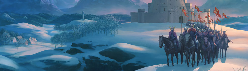
All screenshots can be found here….
DR will follow on after LOM, but we will make decisions about its look and feel after we have gone through the pain of LOM! 🙂
All screenshots can be found here….
DR will follow on after LOM, but we will make decisions about its look and feel after we have gone through the pain of LOM! 🙂
Those screenshots look amazing… :O
Yes, very nice art indeed. That soft painterly aliased art style works for me.
It’s funny but I was thinking that maybe what LOM needs is an update to the landscaping technique. The original wowed us with over 6000 unique views. Imagine if these days the game could paint a fantasy landscape for each location (that can also change with the current lighting conditions/direction) you would be happy to stare at for hours.
It’s not that different from working on Tiger Woods golf, where part of the gameplay strategy was to stare at the landscape ahead of you to figure out your next move.
DDR tried to achieve that with the jigsaw affect. Basically every location acts as a random seed and then graphics can be built up based on that location and the surrounding ones. Every terrain becomes customisable then based on all those factors meaning that each location becomes more and more unique.
Yes, I thought that worked very well It helped break up the repetition that was found in the LOM conversion- which was made even more obvious by the added detail in the new LOM graphics.
As anyone who’s had to create texturemaps will tell you, the trick is to add enough detail to make the texture interesting- but bland enough so you don’t see tiling. You have to be able to conceal the repetition. The DDR screenshots seemed to do that.
But it’s something that the original LOM art never suffered from, mainly because of the large amount of negative space (low detail) used.
Good quote in a review of the old ZX game Explorer that sort of sums this dilemma up…
“…in Midnight the graphics were simple but every view was different. In Explorer the views are extremely detailed, but it’s almost impossible to tell them apart”
http://www.worldofspectrum.org/showmag.cgi?mag=SinclairUser/Issue059/Pages/SinclairUser05900085.jpg
I’ve just had a look at the DDR screenshots – very nice!
This is the sort of thing I was referring to before, in that it’s still recognisable as the game its based on, but using modern technology and techniques to do what the spectrum simply couldn’t have done.
I don’t believe that’s taking anything away from your imagination – its just taking it and bringing it to a (hopefully new) audience who will have certain expectations – especially if they are under about 35 years old!
I get that a book means you create your own world around the narrative, which is great, and a bad movie ruins a good book – but a good movie enhances it, in my opinion. As a fan of Cornwell’s Sharpe series, I thought the TV adaptation was so well done that even when I read the books, I draw on that to feed into my imagination.
Going back to the DDR art, you can’t see it from a still – and I’m no artist, but the only thing I would consider adding (besides ensuring high resolutions are supported for the newer tablets) would be some very subtle animations and background sounds; flames flickering on torches, rivers flowing, the horses breath to illustrate the cold, etc.
I look forward to hearing more about the new version as it progresses 🙂
Having just bought an iPad I am very please to hear that LOM is soon to appear on that format. I too am torn on the graphics style question, but whatever the decision, it’s a pretty sure bet I’ll be after the LOM app on the day of release.
I’m so excited about this.
Re art style: the look of LOM always seemed evocative of Tolkien’s drawings and paintings. I feel that surely the art style should reflect that, rather than aiming for photorealism. Beautiful rendering of tactile-seeming brushstrokes and paint are a worthy use of the powerful hardware.
Didn’t the LOTR films have 3D flythroughs of Tolkien-looking maps? That’s the sort of style to go with, I think.
I’d love a retro option at least, a la Monkey Island remakes.
Excellent article. Thanks for sharing this.
Hi chris, I’ve played lords of midnight from the speccy days and your fine ports, I’m more than happy to play test on the iPad for you, if needed, keep up the good work. John.