Early on, when Mike and I were starting the process of thinking about how The Lords of Midnight might look, we played around with a few tentative ideas. We spent some time thinking about being in full 3d and then settled on building 3d models of the terrain and rendering them down to 2d. The main reason for this was performance. Mike was worried that we wouldn’t get the fidelity and quality out of realtime 3d that he was looking for. The option was to go for slower renderer to crank up the quality.
We were unable to get anyone who had time to build the models so we continued on with normal 2d images so that we could have the engine up and running and game most of the game complete. We could then drop the correct imagery in at the end.
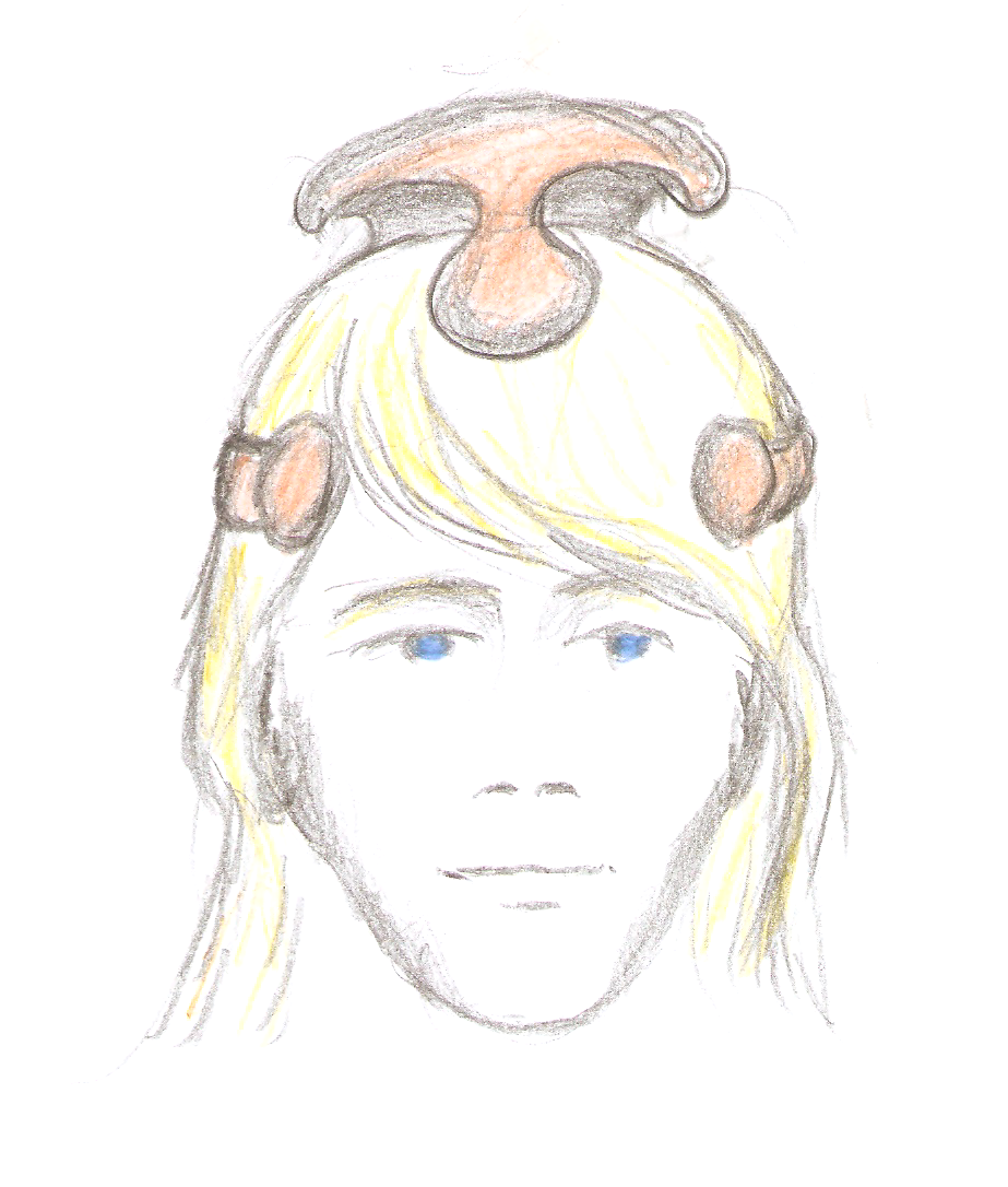
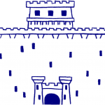
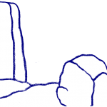
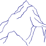
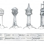
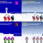
We obviously couldn’t go with the original graphics. There was just no way that we could keep the blocky originals. First Mike did some hand drawn versions of the originals.


Then he did some coloured versions.
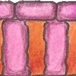
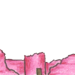
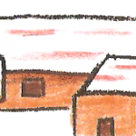
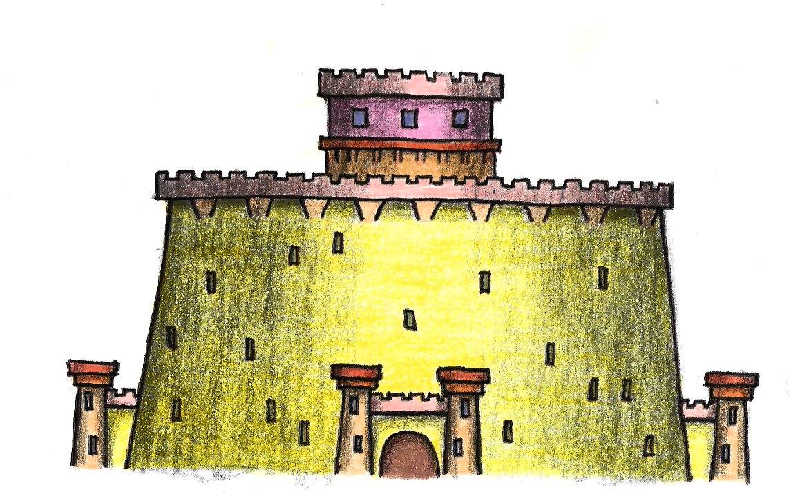
We could never agree on the coloured versions. I didn’t particularly like them, but we agreed that they were a work in progress and gave us a talking point about what we did and didn’t like about them, and the problems that the approach raised. A proper artist was going to be needed to do them properly.
I wanted to use graphics that I had used in TME. Not the original Lords of Midnight ones, but the graphics that Jure had produced for Doomdark’s Revenge. But I just couldn’t convince Jure to work on the project! 🙂
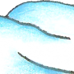
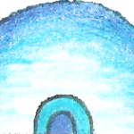
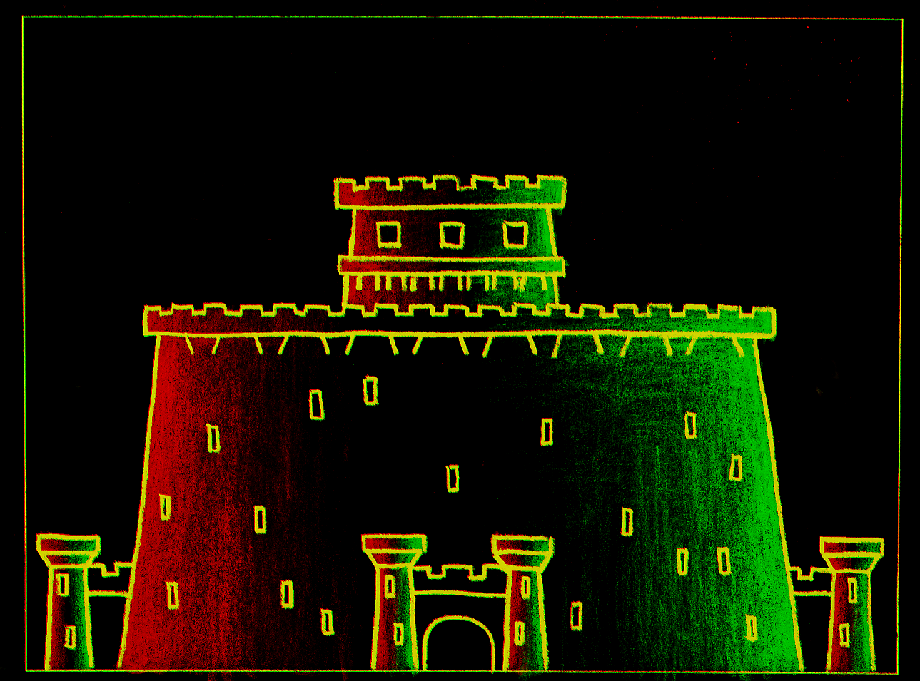
One of the ideas with the coloured versions was a concept that Mike was calling Ink. With 3d you get lighting. With 2d if you try to do lighting it is usually very flat. Mike’s idea was to give each 2d graphic its own normal map. This would allow the 2d images to have directional lighting. The images would also be made of a very small palette, say 8 colours, and this palette would be expanded to use variants of the colours depending on the lighting etc. The idea is that a terrain is generally only a few colours, it may be many shades of that colour, but still only a few colours. The palette would also be adjusted depending on location, owner, night and day. Things like windows could be lit up at night, and the same graphic could have different lit windows depending on its location.
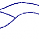
For a while Mike played with the idea of painting this lighting information onto a 2d image directly to remove the requirement of building models.
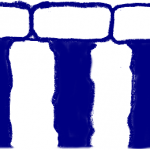
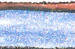
Example of a lighting map.
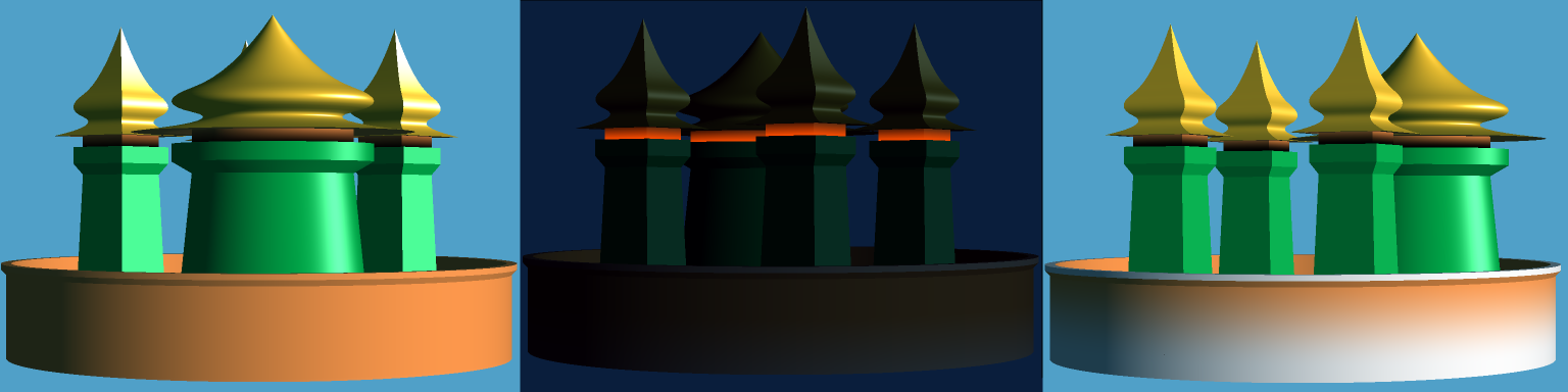
An early test of a simple model that Mike rendered.
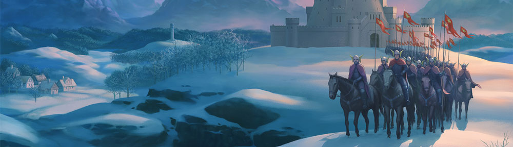
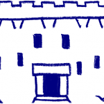
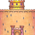
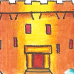
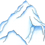
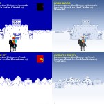
We then played around with some more specific hand drawn images. Chris Webster offered to have a bash at coming up with some ideas. The following show some of these early tests.
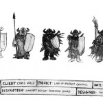
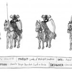
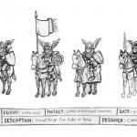
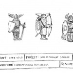
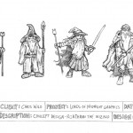
In principal Mike liked them, as did I. But we couldn’t agree on them. Mike didn’t like the fact that they hilighted the squat nature of the original graphics. The more realistic hand drawn versions just seemed to enhance the problem. I however, liked it as a style thing… unfortunately we never finally pursued this area to it’s logical conclusion because of time.
After Mike died I started looking at how the images could be drawn by me. Ross Harris handed me a quick filter idea on photoshop. The idea being that the images were more of a medieval painting, which is how Mike always saw the original game. The view was more of a tapestry.
After seeing Ross’ idea, I had a play around with photoshop trying to achieve something that I might be happy with.
Luckily, it was about this time that Jure offered to help bring the project to conclusion!
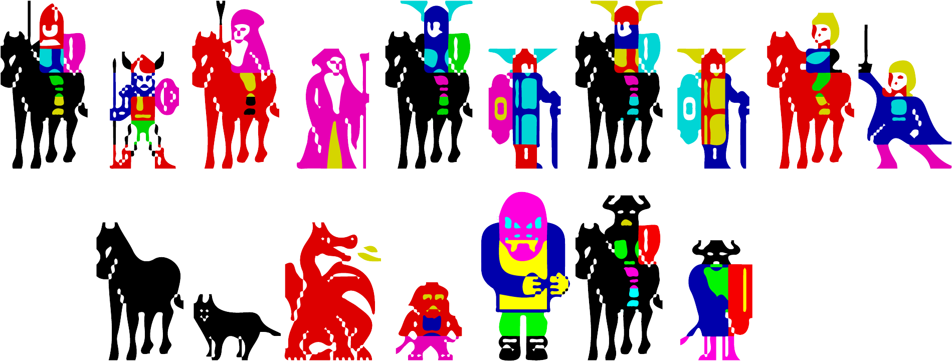
Jure produced two sets of images. One set that were faithful to the original, and an alternate set that he would have preferred to use. One day I do intend to release a version of the game with the alternative set.
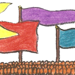
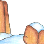
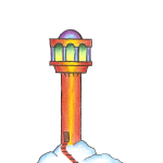
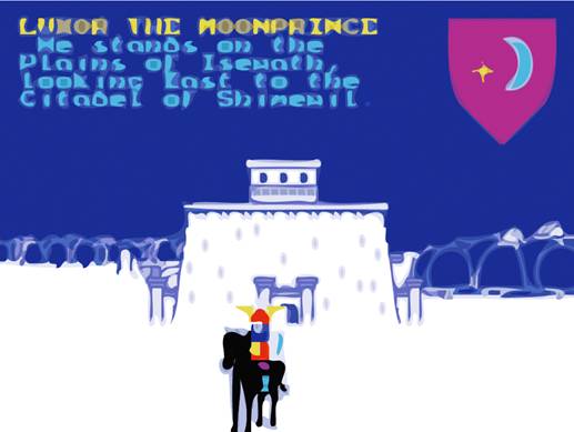
And finally, here is an image of Luxor that I found on Mike’s machine…