Thought I’d post an update for LOM. I realise that it’s been over 2 months since I last had anything to say on the subject.
Firstly, it’s been a busy few months for both Mike and myself. Mine work related and Mike’s more personal. That combined with a little bit of sidetracking on Eye of the Moon.
Two of the issues with this project is time and getting it right. Neither of us are working on project full time and it’s very easy to lose a week before you know it, just because you were overly tired or didn’t feel like sitting in front of a computer. I’m sure that winter is the best time to do development and not in the summer.
The getting it right aspect is about thinking about the project more than actually doing it. Over the last 2 months I’ve been going round in circles about the graphics of the game. I’ve been thinking about a number of different approaches that we have considered for the look and feel, and the way the user interface will work.
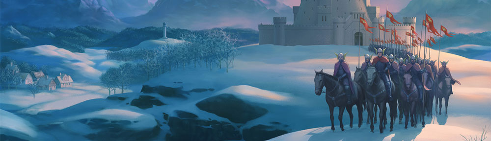
The original LOM had a very distinctive look and feel. Simple, but very affective. Somehow with the very powerful modern technology, we have to achieve the same result. I sat down recently and gave some thoughts to the way LOM was going to look, and was not happy. I’ve had firm ideas about the direction of the graphics for a long time. Mike brought new ideas to the party when we start discussing the new game. And in general we had a consensus about the way forward. But then I started to doubt… I kept thinking about Jaws. Jaws works because the brilliant robotic sharks that Spielberg was going to show off all over the place, didn’t work. In the end he had to work around them, utilising them sparingly. The end result, much more suspense to the film.
For LOM, the shark was the graphics. Mike wrung an awful lot from the spectrum, but in the end, the setting of the story was defined by the minimalist graphics – a world full of white snow! So, as you start to up the quality of the graphics you are moving further into working shark territory. LOM was stylistic and I feel it has to remain so. Simple and stylistic.
I discussed this with a few people and then went back to Mike in order to tell him that I thought we were the wrong people to be thinking about the graphics. And that if we continued down the path we were following, I felt we were going to make a mistake. Mike agreed.
So, last week I had a meeting with an artist. Fergus McNeil ( some of you may remember his 8 bit days with Delta4 ) and asked him to take over artistic control of the project. I’ll keep you posted with anything I can on the visuals.
In the mean time. Tonight I am back at the computer – coding!