I have finally managed to get The Lords of Midnight and Doomdark’s Revenge ready to return to the stores. Yes I know it’s taken a while and in reality it’s been a labour of love, but we are almost there. I have had both games running on iOS, iPadOS, OS X, Windows, and Android.
I am hoping to release the games during January, I have put a lot of work into this rebuild of The Lords of Midnight and for that the game will now cost a total of NOTHING! I initially intend to keep a price on Doomdark’s Revenge, although if you’ve already paid, you won’t need to pay again. But I also intend to include some In App Purchases in the future.
Right now, I would just like to get as many people testing them to make sure that they are behaving as expected. I am sure there are a few little niggles, and I know there are a couple of small UI features that I removed; awaiting a rebuild. I just decided not to hold up the release because of them.
To start testing The Lords of Midnight…
- iOS/iPadOS – Apple store link.
- Windows – Download
- OSX – Download
- Android – You need a Google Account to join. Send me your email through the form at the bottom of these page. I will then add you to the testing group and you can then Join from Web. Join from Device.
To report any issues either use the links supplied as part of iOS/Android testing system, visit my issues page on GitHub or fill in the form at the bottom of these page. Please provided as much information as possible, screenshots if it helps, and details of your device.
Some of the things removed.
Detailed map needs the ability to scale.- Desktop – Cursor images need adding
- The compass gadget is missing from the look screen
- Desktop – Some keyboard shortcuts are missing
- Mobile – Some gesture shortcuts are missing
Desktop – Only runs in a window. Should open a window in 16:9 at about 75% the hight go your desktop resolution.
Known issues
Splash and Credits screen crop badly top and bottomDesktop – Direction number keys are mapped incorrectly- Scrolling indicators/icons missing from think page and popup info pages
Names on the map collide with each otherOptions screen has incorrect options on it for platform
Some of the changes.
There have been some UI changes that I have added either for flourish while I was rebuilding or out of necessity.
The landscape view now adapts to your screen resolution much more dynamically. It keeps the same aspect ratio (1.3333) of the original for the height of the view but allows the width to grow. The affectively gives you a wider field of vision or wider devices. I did feel originally that this was an unfair advantage to those on with resolutions closer to the original, but in the end I decided that the advantage was minimal as most people look around them anyway,
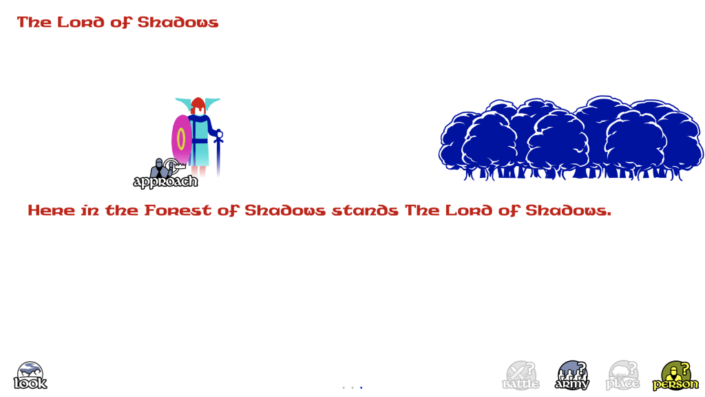
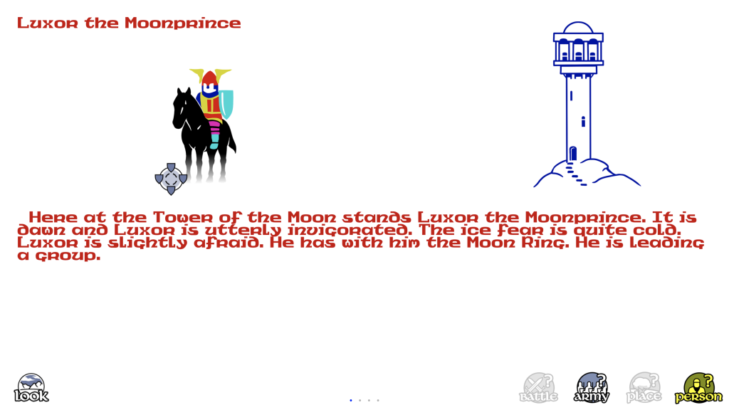
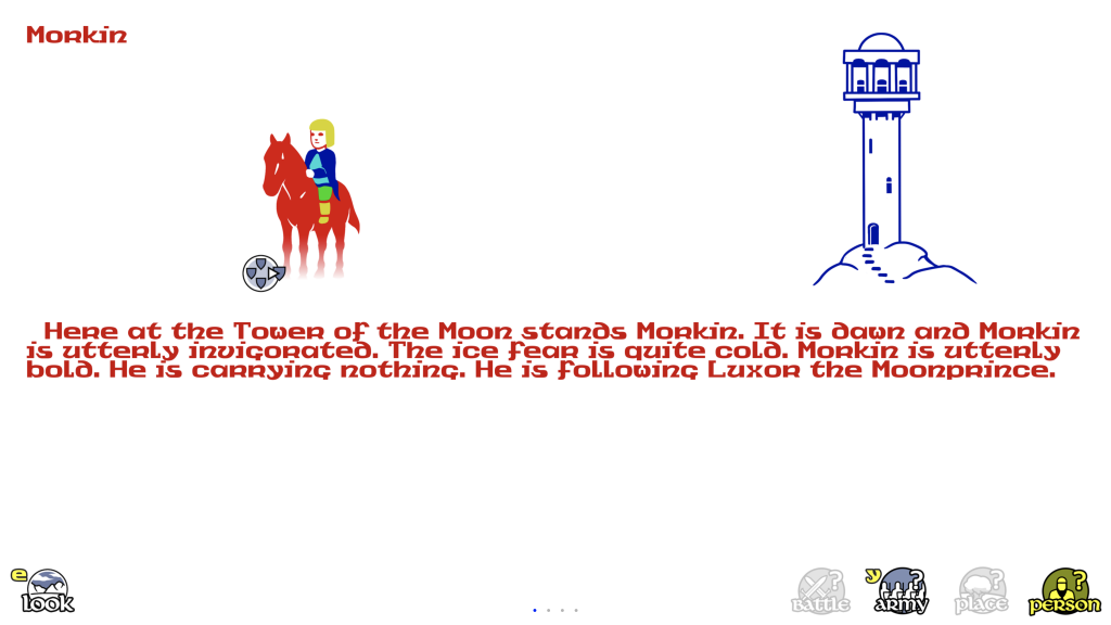
The Think page changed a little. The first is that the text now scrolls vertically if it gets to long. Again this was to help with certain resolution issues. But also each think page now scrolls horizontally in a fashion more akin to scrolling pages on mobile devices. Note the page indicator at the bottom of the screen.
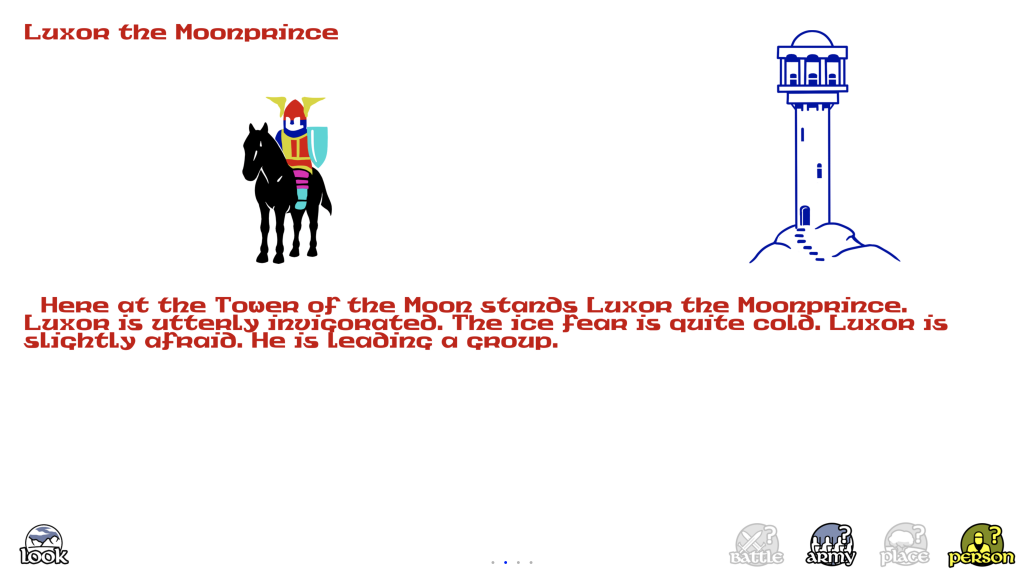
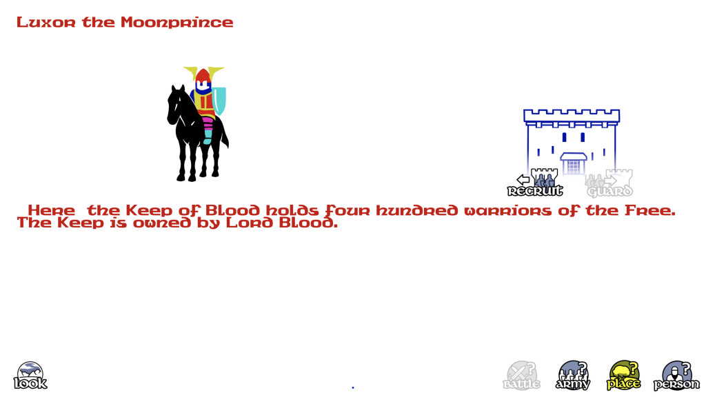
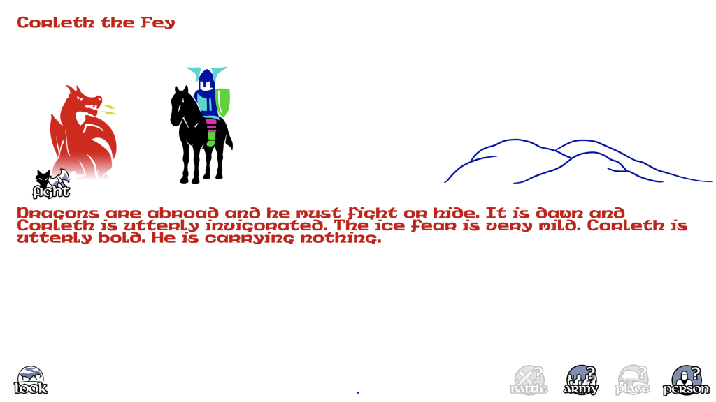
The following screens show some new additions to the think screen that allow to take certain actions direct from there.
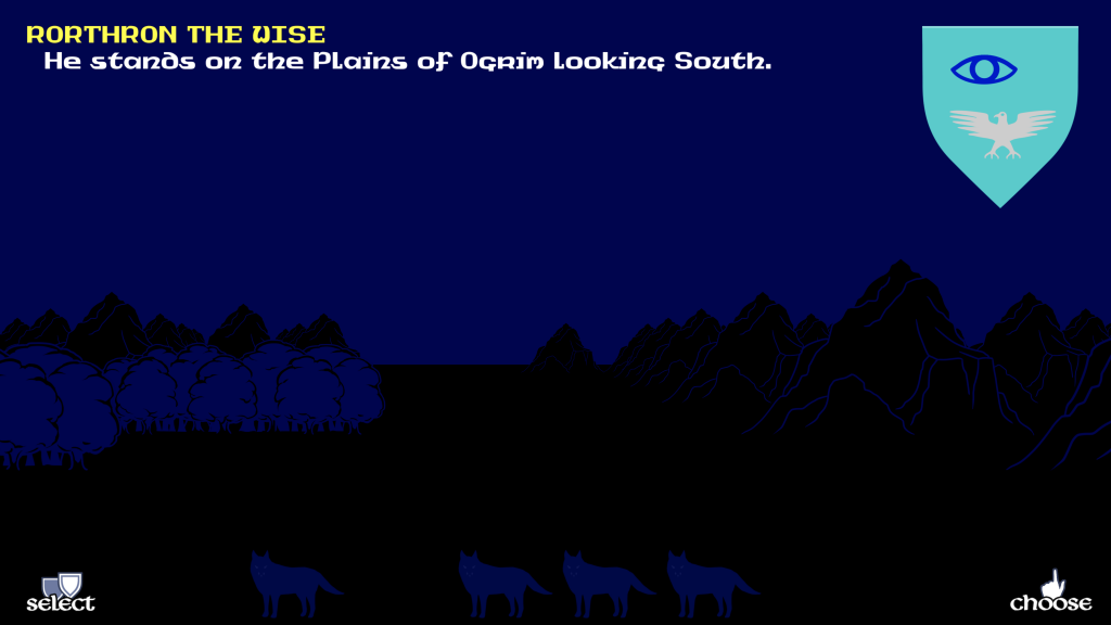
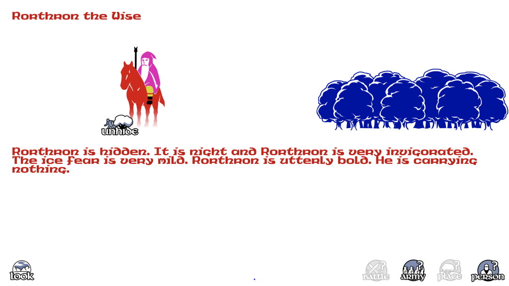
Showing the new display when it’s night… more like the original.
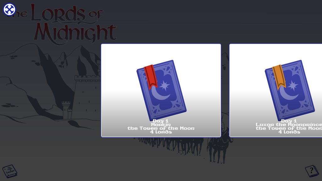
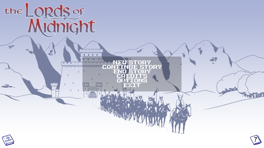
Two changes that have happened on the main menu. A bigger scrolling area for the stories and a new stile menu screen.

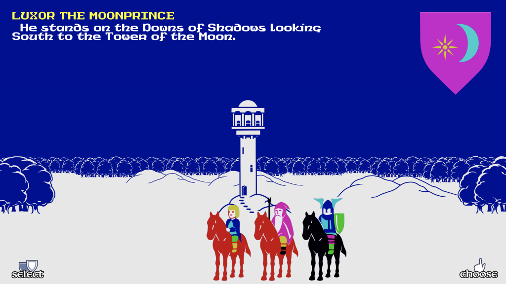
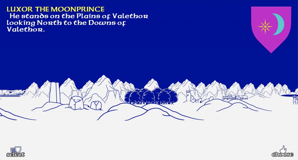

 I finally managed to push out the update to Lords of Midnight. All platforms have been updated to 1.11
 And, armies were fighting double at night. Which means battles would have been quicker than they should have been because double damage was being dealt out. This would have meant that you could have lost a fight without the chance of escaping, because you should have had a turn between the two battles. Or the armies on both sides are unable to get reinforcements between the two battles.